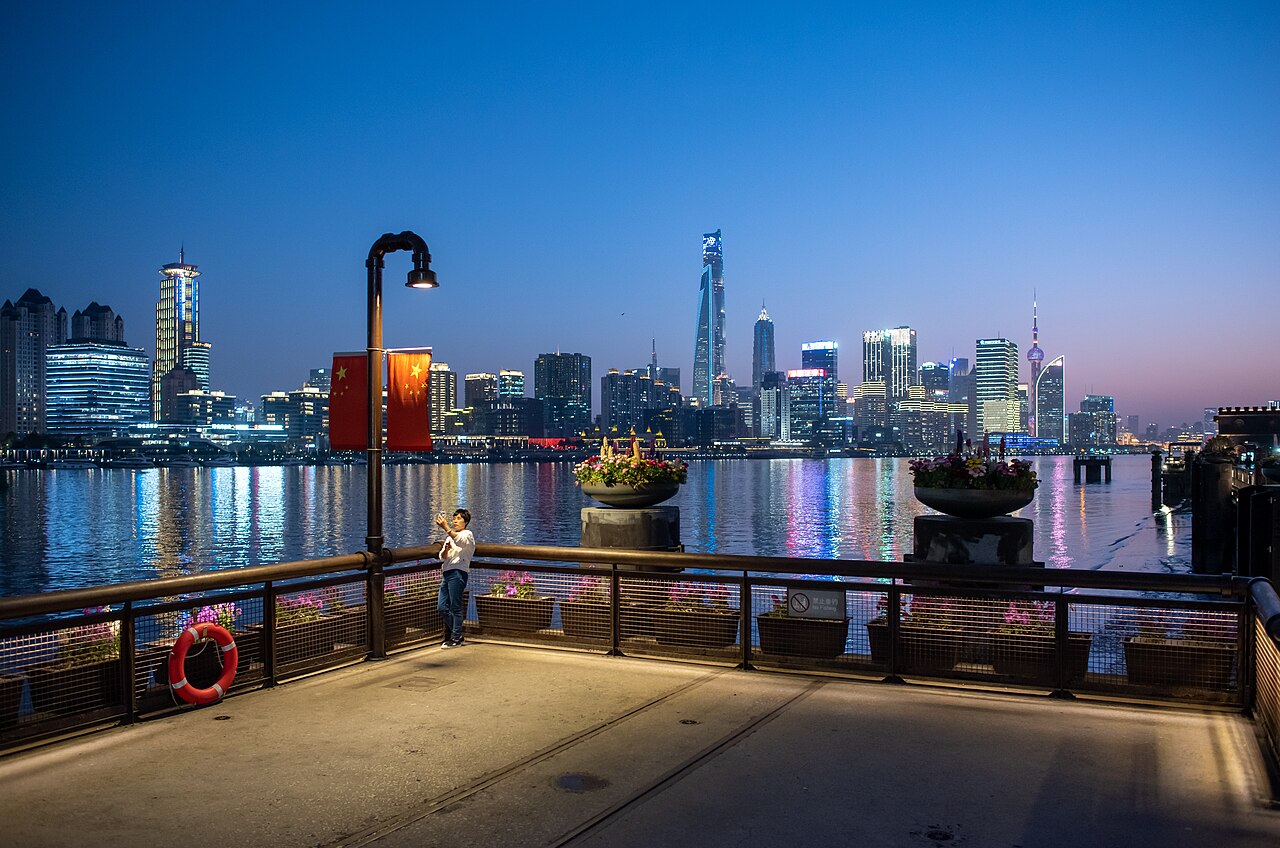
🇨🇳 ChinaSpring 2019
Charlie fong / Wikimedia CommonsCity signal
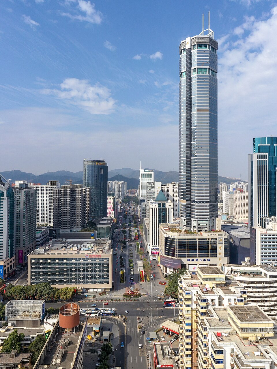
Shenzhen
Electronics markets, ferry terminals, and factory districts sharpened the designer's sense of pace.
Compact products should still feel alive, repairable, and precise.
Cyber product image cues
Component markets as material libraries · Dockside wayfinding · Dense retail lighting after dark